For our first week project, we were assigned teams and asked to determine a strategy for increasing attendance at an annual fundraising gala for a non-profit called WomenTechWomenYes(WTWY). The objective as described in the e-mail received from the prospective client, WTWY, was to "..place street teams at entrances to subway stations. The street teams collect email addresses and those who sign up are sent free tickets to our gala." The only reference to data was to MTA subway turnstile data, which is freely available from NYC.
OK, fair enough. While certainly there wasn't much detail in the original e-mail, in practice this is often the case. An effective data scientist needs to be able to work with ambiguity and iterate through a design process that includes brainstorming, multiple sessions of end-user interactions, and prototyping to finally converge towards a desired solution. Critical to this process is understanding what data sources are available and familiarizing yourself with the structure and content.
During our initial brainstorming sessions, and being highly ambitious Week 1 students, we naturally had some delusions of grandeur involving complex geospatial and economic analysis to identify the "target demographic": people in tech who would be the most willing to donate. However, after thinking about the problem some more, and examining the MTA data, we decided on the KISS (Keep It Simple Stupid) approach. Ultimately, you need to be comfortable with the data and the tools in your toolkit for analysis. So, we broke the problem down into three primary objectives:
- Maximize Gala Attendance
- Increase Donations to WTWY
- Enhance Exposure and Expand Outreach
In order to achieve those objectives we were going to focus on volume as the primary metric - increase probability of sign-ups by targeting stations generating the greatest amount of foot traffic. The thought being that unless you really got the target demographic analysis down, a street team member is likely going to have ~5 seconds to get someone's attention. Let's increase the odds, but having them engage with the most amount of people possible.
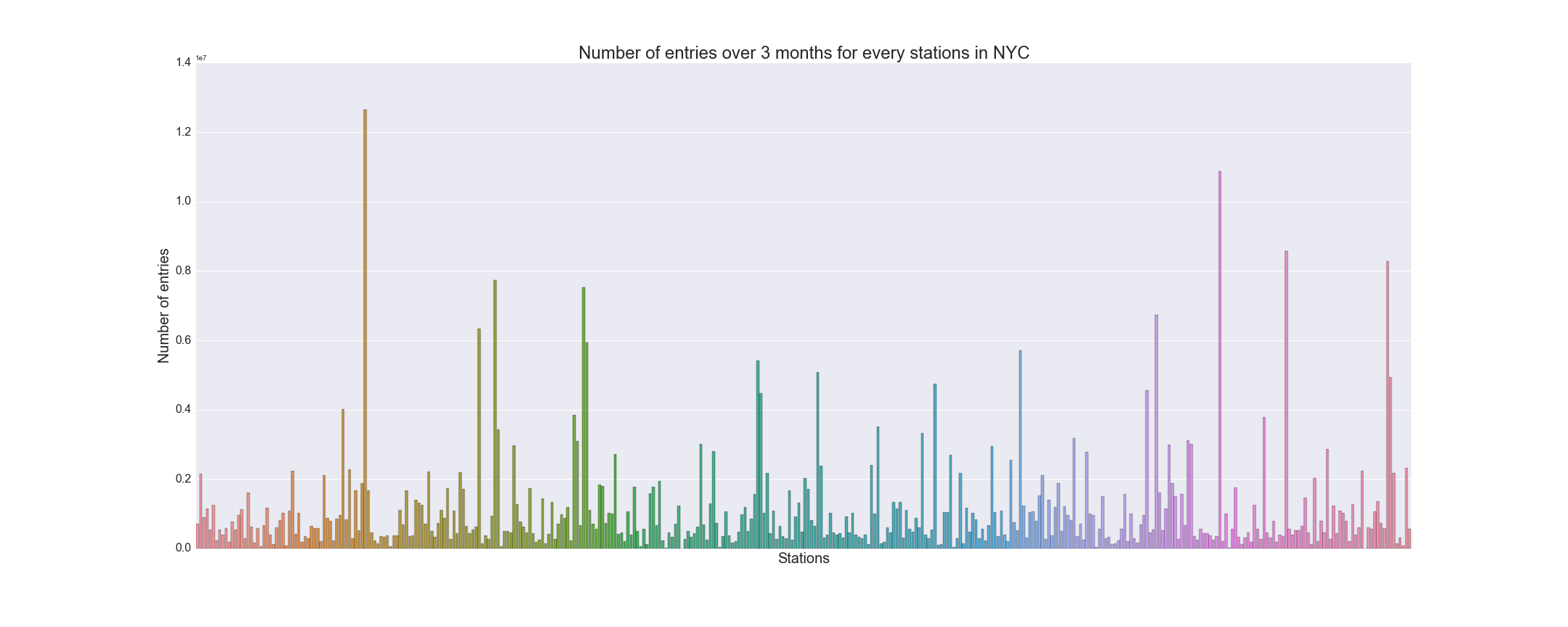
Our first analysis focused on overall volume of entries per station over the course of twelve weeks (April - June). We chose this timeframe because it was close enough to the actual gala date (early Summer) that it would be on people's radars for possible interest. The total volume graph by station is shown below.

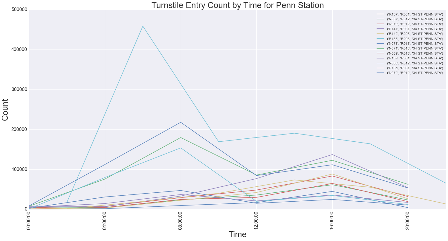
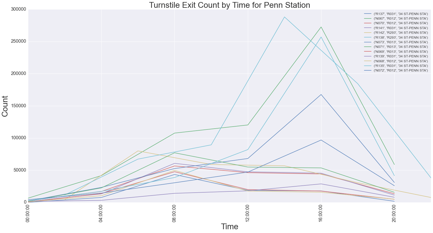
We took that data and narrowed the stations to examine to a Top Ten list of greatest volume of entries. For that list, we then started to look at peak days and hours, which not surprisingly, corresponded to weekdays and AM/PM rush hours. We proceeded to do further drill-down to examine entry/exit counts to narrow down to specific turnstiles or groups of turnstiles, called Control Areas (it should be noted the MTA has a complicated hierarchy for how turnstiles are identified). This gave us greater fidelity for how to deploy street team members within key stations. It also identified anomalies in foot traffic patterns at particular stations, whereas the number of entries and exits were not always uniform. For example the graphs below show the turnstile entry and exit counts for Penn Station, a major commuter hub.


Overall, this drill-down analysis method using volume data was an effective approach towards identifying locations to place street team members. We did encounter some pitfalls along the way, largely attributed to anomalies in the MTA source data, for example skewed data due to unexpected turnstile resets or inconsistent time intervals for the entry/exit count statistics. Not unexpected, and something you always have to be aware of, which is why its imperative to familiarize yourself with any data sets before making assumptions or conducting analysis. There are definitely other approaches that could have been taken, and it would be interesting future work to examine socioeconomic data in addition to the raw turnstile data, to better identify a target demographic and known locations where that demographic travels (i.e. stations near tech hot-spots like "Silicon Alley").
All in all, a great team building experience to get our collective feet wet in the world of data science!